
Blogging has been a simple, yet insightful experience for me. I’ve learned a lot over the pass few months about how to decorate my blog, how to examine posts, how to write posts, etc. I feel I’ve learned some very important things about the web and how it functions. Even though I’ve been using the web for most of my life, there is still a lot I don’t know about it. This blog has been a real help in making me knowledgeable about the internet as a whole.
This blog has mostly been a place where I can discuss the concepts of color theory and how it works in the art world. Color theory is something I’ve known a lot about for the longest time. I taught myself the different techniques and methods of color theory to help me develop my drawing skills. Which is why I decided to make my blog about color theory.
There is no real rhyme or reason as to how to navigate my blog posts. It’s mostly just me having fun with what I’ve been writing and posting. Most of my posts are easy to understand, I try to use the simplest of conventions so everyone can read my posts without need any outside information. If you want to read about color theory, I have a couple of posts on it. Otherwise, you can have a look around and see the other things I’ve posted about.
My main goal with this blog post was to have some fun with it, I think I’ve accomplished just that. Throughout my time on this blog I’ve learned new skills that may help me further my understanding of the web as a whole. I’ve also been able to further skills that I already had before this and I can’t wait to learn more.
Author: alpacanan
New Medical App Idea
Today I will be explaining an idea for a new app. The idea for this app is that it will help track the medications and needs of those who are less able. Elderly people or people with chronic illnesses would be able to use the app to track what medication they need to take, how much of it they need, etc. This app could also be used by their caretakers to help track whether or not they have taken their medication.
This app would be vital for those who need to have a complete understanding of what exactly they are taking medication wise. You would be able to put in your medication’s information and the information about your health conditions. The app would also ask for your doctors contact information so that it could gather more important medical information from them. The app would then take the information given and use it to calculate how much of the medication you must take. You would also have to fill out an information board once a day on the app, which will allow the app to more accurately calculate data. This information board would ask questions such as are your feeling energized or drained? How much sleep did you get last night? Etc.
This app would be simple to use; everything would be organized into categories which would allow the user to easily navigate its different functions. The app would detail all the information that is necessary for the user to understand. You would be able to view all the details of certain medications and treatments that the app has been given. This app will help people be more organized with their health in general and anyone could use it. This app would be able to help people with underlining medical conditions or illnesses that are hard to track.
The app will also need to be easy to read; a simple font and big lettering would be best for people with sight problems. The app would also have to have a simple button interface for people with dexterity problems. The colors of the apps interface would be soft, mid-toned colors that will not hurt a user’s eyes when they are using the app.
Overall, this app would help a lot of people. Whether you have serious medical conditions that require a lot of careful planning, or you just need to be able to keep track of how many pills you need to take a day. You would be able to utilize this app to help you stay organized no matter how serious the condition is.
Color Theory: Complementary Colors
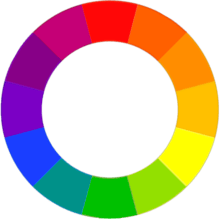
Today I will be exploring the idea of Complementary Colors using the RYB color wheel and an audio post below.
Color Theory: Contrast
Contrast is arguably one of the most important things in color theory. The contrast of an image can be changed with the smallest of touches from what angle you look at a piece of artwork to which angle a photo is taken at. Contrast is affected by the colors we see, for this example I will be using black and white as a sort of control group for contrast. We all know that black and white are opposites, they contrast each other, and you will often find that white looks better when it is surrounded by black. The same can be said for dark colors and light colors, they contrast each other, and they give an image life if used properly. However, there is still an area of contrast that we have not discussed, one could say it’s a bit of a “grey” area. I am, of course, talking about neutral colors such as grey. Mid-toned colors are complemented by both lighter and darker colors, but they do not contrast with each other. From what we know so far, colors are supposed to have both a contrasting and complementary color companion. However, neutrals often don’t have one or the other, this is what introduces us to the idea of warm and cool colors which is another important part of color theory. The subject of warm, cool and neutral color theory will be explored in a future post.
Hosanna (Praise is Rising)-Paul Baloche
This is a YouTube link to a lyric video for Hosanna (Praise is Rising)-Paul Baloche
This is a link to a live performance of Hosanna (Praise is Rising) on SoundCloud
Hosanna is a Christian worship song written by Paul Baloche. It’s a song on the longer end of the scale, clocking in at a little over 6 and a half minutes. The song is uplifting and encourages people to look toward God and continue to do good even when in dark times. Hosanna teaches us to continue moving forward in the name of God and His greatness.
RYB vs CMY Color Wheels: What’s the Difference?
Within the first year of you going to school you were most likely taught that the three primary colors are red, yellow and blue. However, one thing you might not have known was that there is another set of primary colors, cyan, yellow and magenta. You’ll often find that the CMY primary colors are used in printers and even some of the most famous artists in history used these three base colors as opposed to the RYB primaries. Yet in school, we’re taught that the RYB primaries are the most important colors, why is that? Today, I’ll be explaining the key differences between the RYB color wheel and the CMY color wheel.
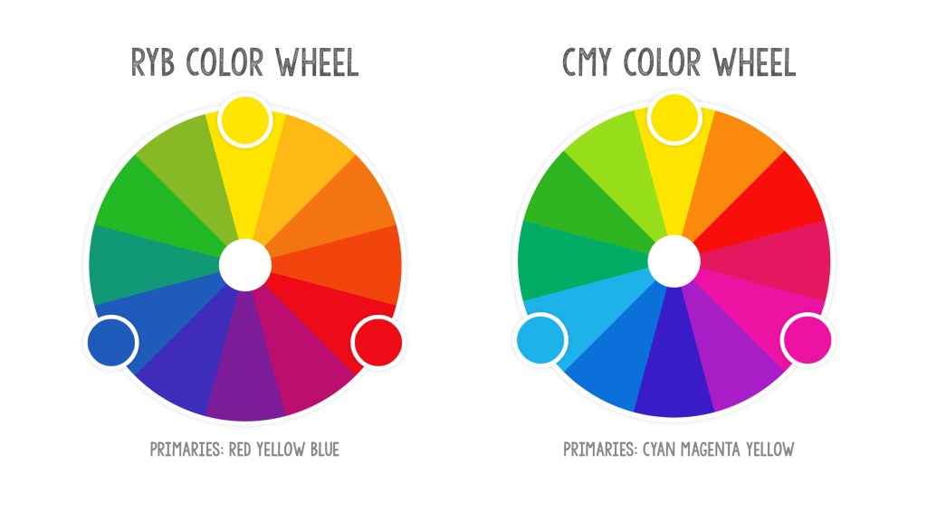
Let’s start off with the color wheel we are most familiar with, the RYB color wheel is very simple. Red, yellow and blue mix with each other to create orange, purple and green secondary colors. Secondary colors can mix to become brown, or even be mixed again with more of the primary colors to change the hue and contrast of the colors
However, the RYB color wheel does have some flaws when it comes to saturation. Lets say you are painting a picture of a vibrant sunset and you need to use a really saturated purple to make the colors stand out, but you ran out of the purple you’d usually use for this. What do you do? You could use the RYB color wheel to mix red and blue to make purple, but there’s a problem, the purple you mixed does not match the purple you used on the previous coat, it’s to muddy. This is where the CMY color wheel comes in.
There’s a reason printers use the CMY primaries, when mixed together, they are more saturated then the RYB system which makes for beautiful, contrasting colors for images. So, instead of mixing a purple using the RYB primaries, you should use the CMY primaries to make your purple, a ration of 1 part magenta and 2 parts cyan will do the trick. With that you have a beautiful match of purple for the painting.
This is just one example of how you can use the CMY primaries rather then the RYB primaries. For many, the RYB color wheel will always have the superior primaries, but many overlook the advantages that the CMY primaries provide.
So, which one is the better set of primaries? Well, neither of them are superior to one another. Both sets of primaries have there own advantages and disadvantages, it just depends on the kind of art you want to make with them. CMY primaries are good to use in bright and saturated images, but can’t create more gloomy or warm contrasted images that the RYB primaries can.
It’s all about what you can create with the colors that matter.
